CAM’s Updated Flower Packaging
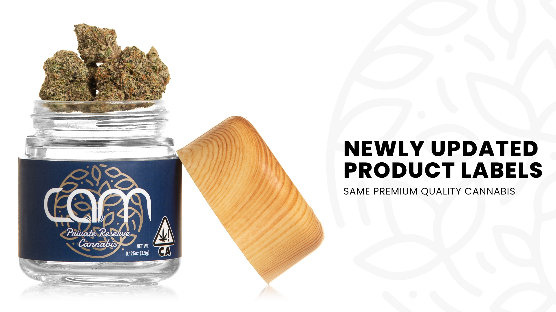
CAM has unveiled an updated look to our flower packaging, just in time for the fall season. Since hitting the California scene, CAM products have only ever seen one major shift in their look. With all the big changes over the last couple years, we wanted to give our jars a look that reflected the consistent, quality cannabis we’ve become known for.
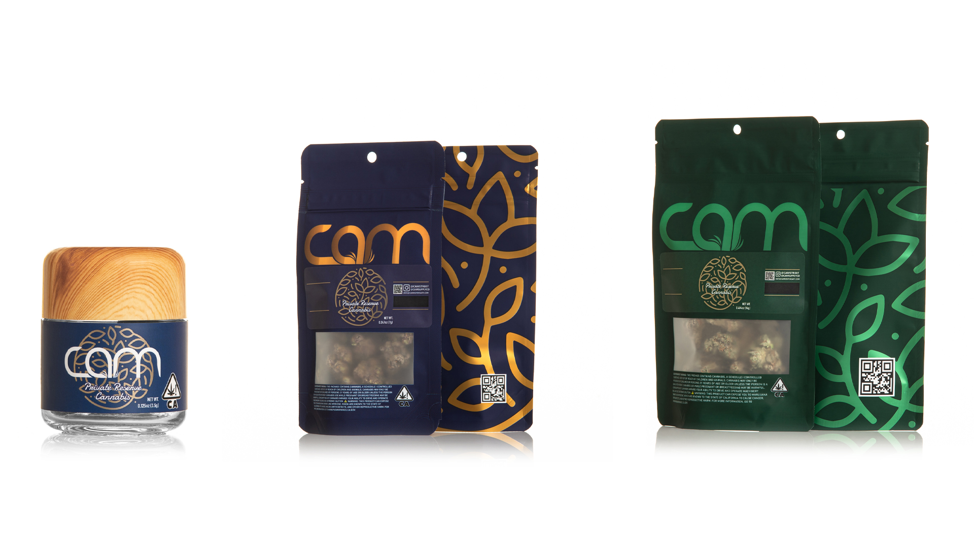
Longtime CAMsters will remember those first batches of Ogre and Apple Pie with the plain white labels and our now instantly recognizable faux wooden tops. After gaining our footing and fanbase over the first few years that we operated in the Golden State, we solidified our identity on the shelf with a total redesign. A more professional style featured soothing Green and Blue color tones and a dynamic stylized flower logo. Our latest refresh takes another step in that same direction, projecting a clear sense of worth while giving more of a backseat to things like THC percentages.
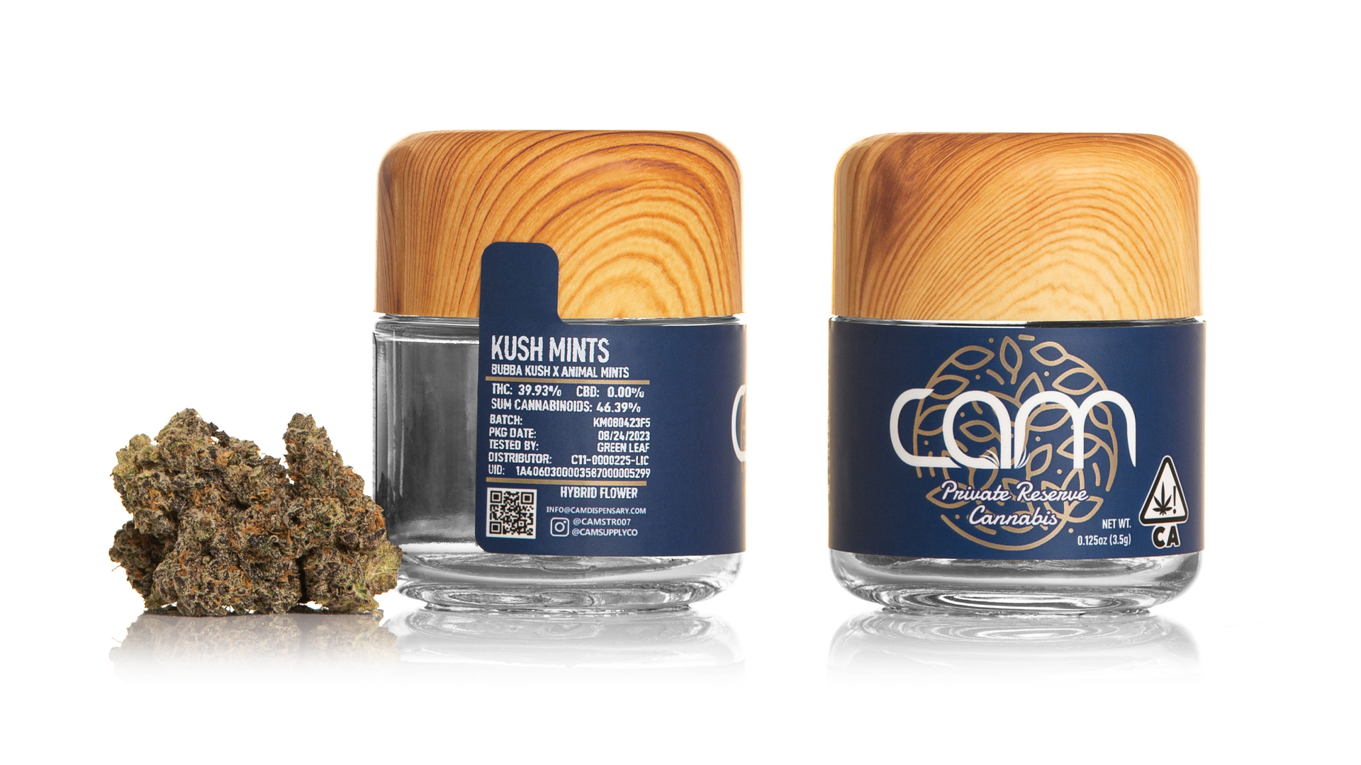
The new California labels feature a field of rich CAM blue highlighting a foil printed version of our logo, one that’s unified with the name rather than resting below it. The green safety sticker is gone, replaced instead by an overlapping tamper sticker that’s connected to the label. Finally, details like cannabinoid content have been moved to the back of the jar. Larissa Vogelbacher, the designer for this project, commented how one of her main goals was to highlight the name, then the flower, and leave things like THC clearly listed but not a primary focus to the eye.

Vogelbacher is CAM’s Onsite Distribution Manager at the new facility. From her unique position, she noticed that the increase in production and audiences meant the time was perfect for a fresh look. After coming up with some initial designs at home she presented them to her supervisor. By the next week, she was surprised to learn that management wanted her to be the lead designer for the 2023 glow-up. Having already been with the company for two years, Vogelbacher remarked how the surprising offer is totally CAM’s style. “The whole management team makes you feel seen. If you’re showing you want to grow and you have good work and a good idea they’re going to support you”
With such a beautiful take on the jars and bags, it’s hard to believe this Sacramento resident is mainly self-taught. “Ever since I was little I’ve loved anything hands-on,” she explained. “I’ve created jewelry, designed clothing, right now I’m learning how to make candles. She briefly switched her major to art in college before landing on Communications and Marketing but aside from taking a handful of classes she’s learned most of these impressive skills on her own. “I guess you could say this is my big break.”
When asked what was the biggest challenge in the process, she relayed that it had been an incredible learning experience going through the multiple rounds of edits and revisions necessary to get it right while still meeting production deadlines. She stressed that keeping the design recognizable was her other main goal, so that CAMsters always know that they are staying true to their brand and to their audience.
We truly hope you enjoy the new wrapping in the same great product.
WRITTEN BY MATT JACKSON